Your Brand's Story Should Include Data. Here's Why.
43% of journalists have used some type of data visualization or graphics in the past year in their reporting.

By Glenn Frates | Published May 26, 2023
In Cision’s recently published State of the Media Report, a trend we've seen for many years was once again confirmed: journalists depend on images and videos to make their content (coverage) more engaging to their audiences.
Among the report's findings, 43% of journalists told us that they used data visualizations/graphics in their reporting within the last year - a slight uptick from the previous year.
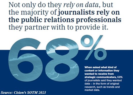
As journalists think more about visual storytelling to engage their audiences, PR and communications professionals have an increasing opportunity to make journalists' jobs easier by providing compelling data and visual assets in their press releases and pitches.
Make Data Stand Out
Leading with good data points is a win no matter what channel a brand is utilizing, whether it's via social media, a company blog, a press release, or email. And highlighting good data points within that piece of content is incredibly important.
Draw the reader’s eyes inward, to that key message and those important figures.
Here are a few examples of brands doing this well in 2023:
- Johnson Controls kept big data points, like "66,000 tons" up top by including them in short, easy-to-read subheadlines.
- Kellogg Company's release about hunger relief efforts kept the data flowing from the headline to the subhead and throughout the body of the release.
- Alaska Airlines utilized the valuable real estate in the first paragraph to highlight important numbers regarding its elimination of inflight plastic cups - and strategic bolding helps draw the eye even more.
Make Journalists' Jobs Easier - Visualize the Data
Want to take it a step further? Utilizing an info-bite is a great way to help your audience and journalists visualize (and better remember!) that key data point.
A traditional infographic tends to run long and relay too much information. An info-bite, on the other hand, spotlights just 1-3 key points for the reader to visually engage with and retain.
Here are some recent examples of brands taking the info-bite approach when delivering their key data points:
- Businesses achieving double-digit improvements with edge solutions
- New AI Enhancement to McGraw Hill's ALEKS Math and Chemistry Program Leads to Notable Increase in Student Learning
- Sempra Reports First-Quarter 2023 Earnings Results
The Takeaway
You want (and need) your content to be relevant and useful to your audience. Highlighting good data points quickly tells a reader why this news matters to them - it's both informative and insightful.
Fight the quick scan with a concise headline that incorporates strong keywords; use multimedia to improve on-page engagement; and whenever possible highlight early in the content good data points to help better connect your audience with your brand's story.
About the Author
 Glenn Frates is Regional Vice President of U.S. Distribution at Cision. Glenn’s 20+ years experience in content distribution and best practices, global marketing strategies and large-scale operations management has provided him a broad perspective on what does and doesn’t work well in the Marketing/PR arena.