Cultivating 'Harmony at Home' Inspires Dutch Boy® Paints' 2021 Color of the Year and Complementary Color Trends
CLEVELAND, Oct. 22, 2020 /PRNewswire/ -- Every home can use more comfort, simplicity and harmony. Embracing these needs, along with trends that emphasize minimalism, relaxed entertaining, and design that evokes art and music, Dutch Boy® Paints unveils its selection of "Earth's Harmony," a vivid, soft blue, as its 2021 Color of the Year.
"Color and design are affected greatly by the world around us," said Ashley Banbury, NCIDQ, senior color designer for Dutch Boy Paints. "With Dutch Boy Paints' 2021 Color of the Year, it's all about helping do-it-yourselfers (DIYers) create spaces that bring a sense of peace to their everyday environments. Earth's Harmony is soft and comforting yet has a vibrancy that inspires consumers to maximize relaxation during their time at home."
Reminiscent of a perfect sky-blue day, Earth's Harmony (237-5DB) is a healing color that reinforces the wellness that comes from mood-boosting, real-life experiences. The hue helps us step out of the routine, appreciate the beauty of thoughtful spaces and embrace home as the place to find comfort and joy in life's imperfections. Nine complementary colors join Earth's Harmony to round out the Dutch Boy brand's 2021 Trend Forecast and form three expertly crafted color combinations:
Candor Palette
The quality of being open and honest in expression, Candor makes a statement that embodies confidence. Earth's Harmony is complemented by the cool blue Vapor (438-1DB), the bold red Mulberry Tree (202-7DB) and True Black (438-7DB) that add balance as an accent to the color combination. This family of colors stirs emotions, while providing a soothing backdrop for daily activities.
Horizon Palette
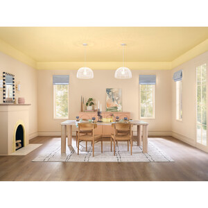
True to its name, the Horizon collection flanks Earth's Harmony to evoke the spirit of living in tune with nature and finding beauty in natural colors. It is filled with calming and pleasing hues that combine the coolness of blue with natural warm tones, including Brightened Cream (005W), Oatmeal Beige (413-2DB) and Sunwashed Orange (312-3DB) to create a place to disconnect and achieve balance.
Serene Palette
In this third color combination, we surrender to the urge for escape and find refuge in beautiful simplicity. Shades of soft mint green, blue and earthy clay add freshness and modern nostalgia. Pairing Cooled Breeze (136-1DB), Grayed Aqua (428-4DB) and Desert Varnish (312-6DB) with Earth's Harmony evokes feelings that help us nurture, grow and sustain ourselves in simple ways.
"Whether reimagining a relaxed environment to entertain, a place to confidently and comfortably take on the day or to find peace and serenity in everyday living, Dutch Boy Paints' 2021 Color of the Year and accompanying palettes provide simple color solutions," said Michelle Bangs, senior brand manager for Dutch Boy Paints. "Inspired by global lifestyle trends, each color in these palettes can be easily customized to unleash DIYers' personal style."
For added simplicity, the 2021 Color of the Year and corresponding Color Trends are available in the Dutch Boy brand's exclusive Twist and Pour container. Visit www.dutchboy.com/color-advice/color-trends/ or your local Menards retailer to explore the full Dutch Boy Paints 2021 Trend Forecast.
About Dutch Boy Group
Founded in 1907, Dutch Boy® Paints continues to be an industry leader in delivering innovative and high-quality products and packaging solutions and is one of the most recognizable brands in the market over 100 years later. In recent years, a new vitality, youthfulness and the promise of Simple Solutions have also shaped the brand. Heritage and trust have been brought to life with energy and empowerment, inspiring DIYers and paint enthusiasts for generations to come. For more information, visit dutchboy.com.
IMAGES AND EXPERT SOURCES AVAILABLE
SOURCE Dutch Boy® Paints


Share this article