NEW YORK, Feb. 17, 2016 /PRNewswire/ -- Zocdoc, the digital health marketplace used by millions of patients nationwide, today unveiled a top-to-bottom brand refresh that will challenge the conventional wisdom – and color palette – of the healthcare industry that Zocdoc has been modernizing since 2007.
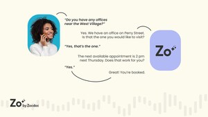
At the center of Zocdoc's rebrand is the patient and a new logo called Zee, a line drawing of a dynamic letter Z and two eyes that evokes an always-changing patient face. Together with an optimistic and warm yellow-led color palette, Zocdoc's new look eschews the traditional blues and greens and common cross and staff symbols of healthcare design.
"The new face of Zocdoc looks the way healthcare should – friendly, simple and, most of all, reflective of patients and real life," says Zocdoc vice president of marketing Richard Fine. "With this redesign, we are finally matching our design philosophy with the ethos of our brand."
Zocdoc's mission has always been to give power to the patient, helping millions of people find in-network, neighborhood doctors, book appointments instantly online, complete forms just once, and manage wellness appointments. But a legacy design system based on two cartoony doctors and an $80 logo never quite matched the vision.
"Zocdoc is re-imagining what it means to be a patient, giving people the help they need beyond just when they're wearing a paper gown in the exam room," says Zocdoc founder and CEO Oliver Kharraz. "Now, our image reflects our vision and is a powerful outward signal of the role we play for patients as a center of care."
KEY DESIGN ELEMENTS
Always-changing logo. Meet Zee, a line drawing of a dynamic letter Z and two eyes that evokes an always-changing patient face. In resting pose, Zee is friendly and warm – eyes open with a subtle smile shaped by the curved foot of the Z. Other Zees are cheeky (with a smile and a wink), feel meh (with a zigzag mouth and downturned eyes), or are puzzled (with an S-shaped mouth and open eyes).
Simplified word mark. Far from the unremarkable two-tone, two-weight Helvetica stamp (cost $80) that marked Zocdoc for its first eight years, the new word mark simplifies the company's identity by dropping the capital D and leaves no confusion about what a Zoc is.
Optimistic color palette. Healthcare has the blues, quite literally. The stalwarts of medicine over-index on the blue and green side of the color wheel. With this rebrand, Zocdoc is taking the bright spot of optimistic and warm yellow. Accent colors in the new palette are saturated pastels and vibrant tonal primaries.
Modern imagery. Real life finds its way into the Zocdoc design lexicon for the first time with rich-hued, slightly humorous and true-to-life photography of patients' day-to-day – a modern Norman Rockwell style. A germy elevator ride anchored with Achoo? Find a doctor. A positive pregnancy test and surprised couple titled with Surprise? Find a doctor. An ever-harder squint at a book with Blurry? Find a doctor.
Animation with Zee out front. The redesign takes Zocdoc's animated heritage in a new direction, favoring animated patients over doctors with Zee as the face of every patient. Oversized, full frame images distinguish the style.
Cleaner search.
- A horizontal homepage search bar brings the Zocdoc user experience in line with familiar horizontal search.
- Round provider headshots on search pages and provider profiles echo iOS and Outlook experiences.
- Clearer marks for in-network and out-of-network providers underscore one of Zocdoc's most prized services – a provider database with more accurate insurance listings than the average payer site.
Zocdoc's in house design team partnered with creative consultancy Wolff Olins on the rebranding work.
"We couldn't be prouder to have collaborated with the team to bring their vision of friendly healthcare to the world," says Wolff Olins creative director Lisa Smith. "Zocdoc is revolutionizing a stale industry to connect with patients in the simplest, most relevant and human way. Zocdoc will radically impact how patients interact with healthcare moving forward, and its revamped brand and digital experience is only the beginning of what's to come."
Zocdoc began its business with online scheduling and has expanded to answer more patient needs. Today, Zocdoc serves 60 percent of the U.S. population, partnering with independent practitioners and top health systems to improve patient access to care. The average national wait time to see a doctor is nearly three weeks. The typical Zocdoc patients sees a doctor within 24 hours.
About Zocdoc
Zocdoc is the tech company at the beginning of a better healthcare experience. Each month, millions of patients use Zocdoc to find in-network neighborhood doctors, instantly book appointments online, see what other real patients have to say, get reminders for upcoming appointments and preventive check-ups, fill out their paperwork online, and more. With a mission to give power to the patient, Zocdoc's online marketplace delivers the accessible, seamless, and simple experience patients expect and deserve. Zocdoc is free for patients and available across the United States via Zocdoc.com or the Zocdoc app for iPhone and Android.
Media Contact
Amy Juaristi I [email protected] I 212.933.9895
Video - http://youtu.be/c0a9NjCiqJ0
Logo - http://photos.prnewswire.com/prnh/20160216/333812LOGO
Logo - http://photos.prnewswire.com/prnh/20160216/333810LOGO
Photo - http://photos.prnewswire.com/prnh/20160216/333813
SOURCE Zocdoc


Share this article